DNB pan-Baltic websites
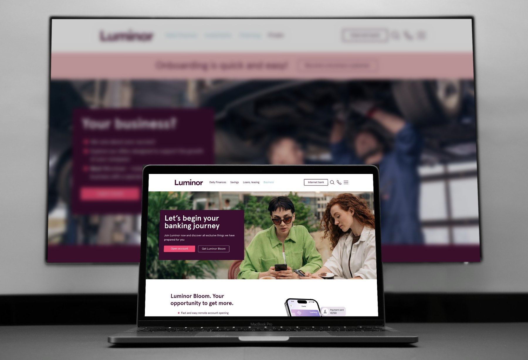
Won a pan-Baltic tender and designed DNB’s websites and design system for three countries. After the merger with Nordea, Luminor kept our site as its platform.
- Client
- DNB Bank, now Luminor
- Country
- Latvia, Lithuania, Estonia
- Industry
- Banking
- Year
- 2016–2020
- My role
- Project lead and UX lead
- Team
- A UI designer on the visuals; external developers built the sites
Problem
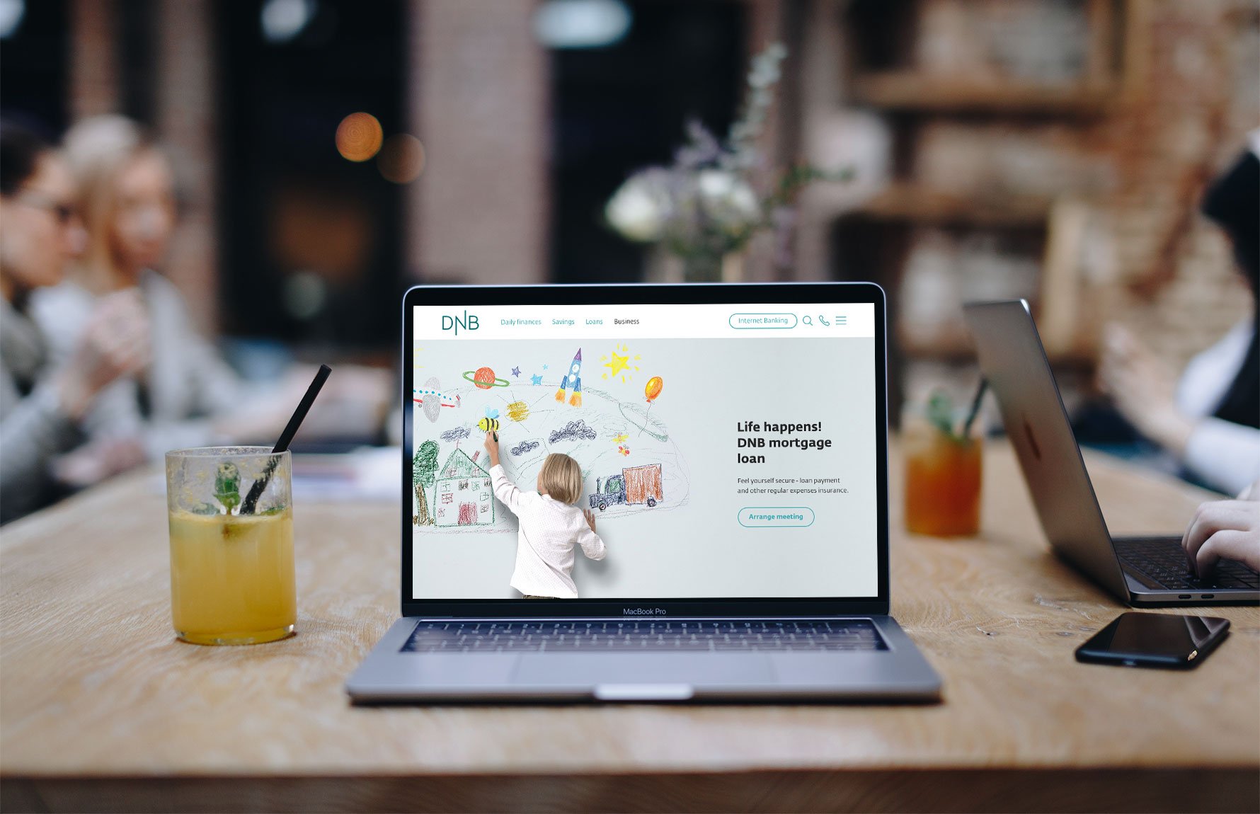
DNB needed new websites from scratch for Latvia, Lithuania and Estonia, in line with its strategy of fewer, clearer choices for customers.
- Three countries, one consistent experience
- External developers would build all three sites, including pages we never designed
Approach
Every decision traces back to evidence. Each step has an ID, and every insight and decision names the evidence it came from.
S001
Source
DNB’s strategy
Fewer, clearer choices for customers.
S002
Source
The developer setup
External teams would build and extend all three sites.
E001
Evidence
Too many products
Five credit cards where two would do.
From S001
E002
Evidence
Mostly private customers
The large majority of visitors are private customers.
From S001
I001
Insight
Show less, one step at a time
A calm page supports fewer, clearer choices.
From S001, E001
D001
Decision
Focused layouts
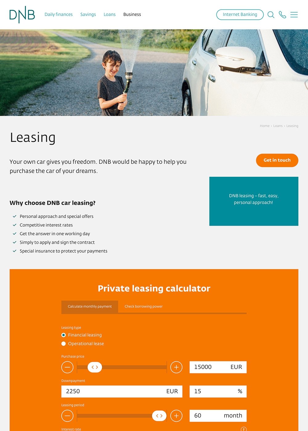
Large calculators and full-screen elements revealed one by one while scrolling.
From I001
D002
Decision
Five cards became two
The site supports the reduced range.
From E001
D003
Decision
Private by default
Corporate clients switch over through the menu.
From E002
D004
Decision
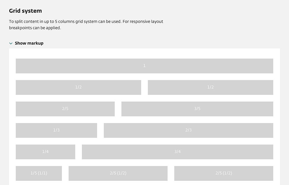
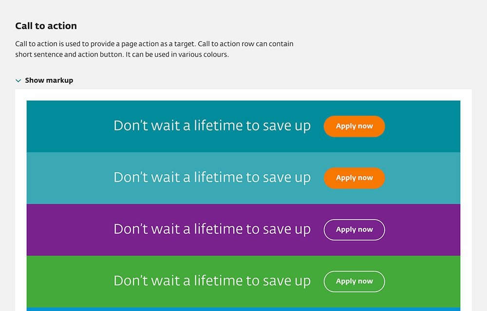
A web style guide
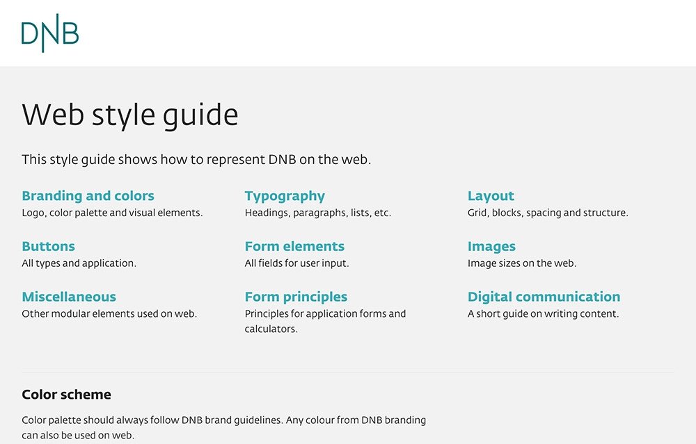
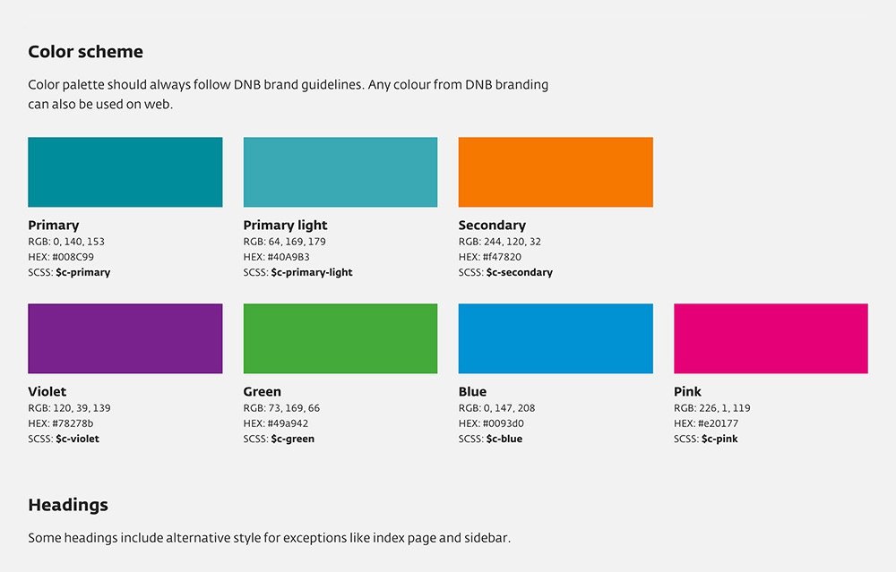
Every component, with code snippets, so developers can build new pages.
From S002
Solution
I led the project and the UX, from the tender to the handoff. A UI designer did the visuals.
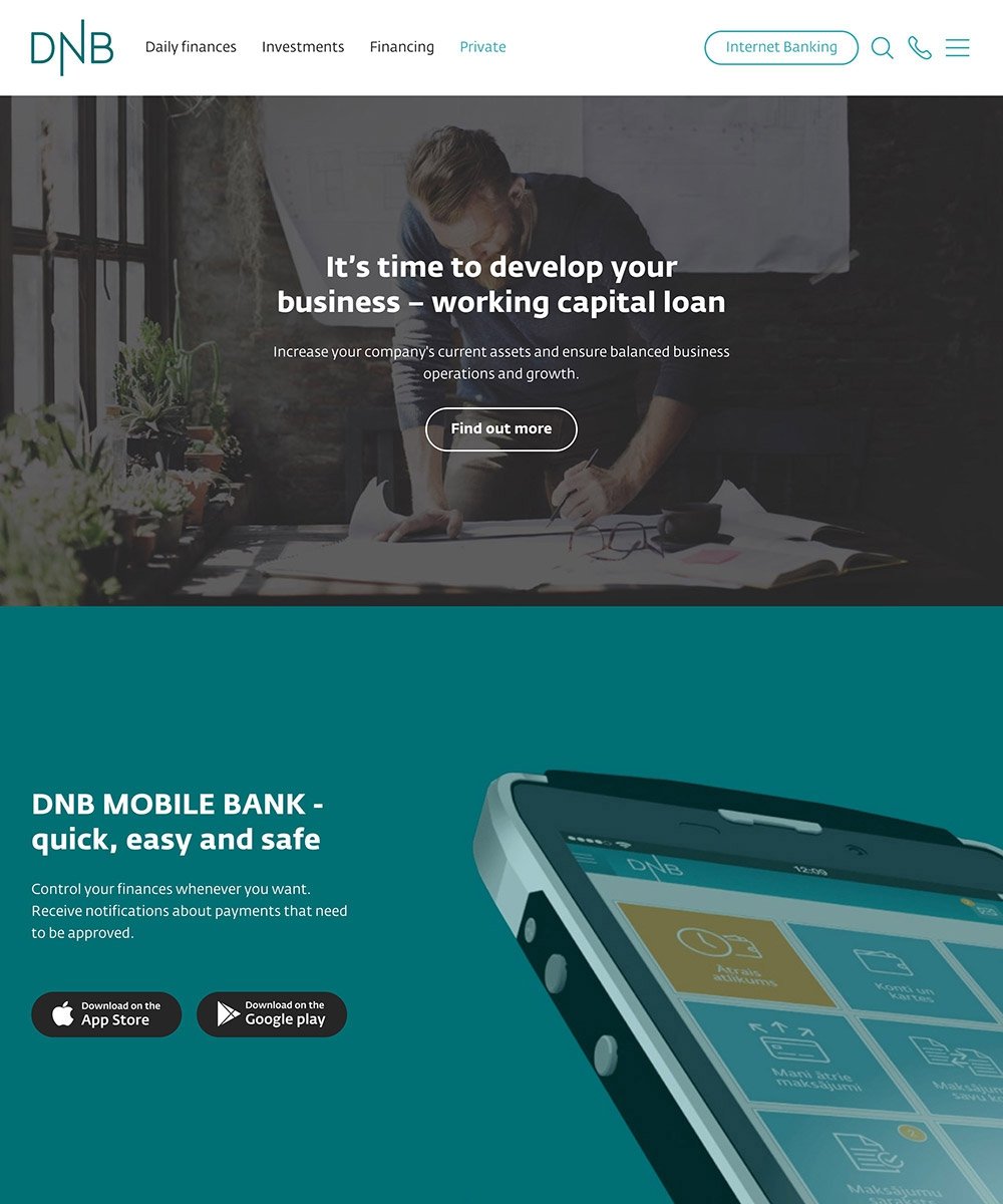
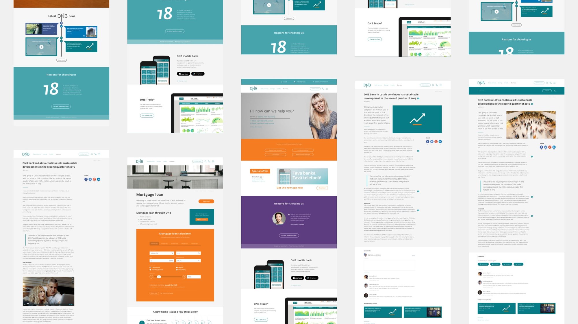
Three websites
We won the Latvian tender first, then the pan-Baltic final.
- Minimalist, distraction-free layouts
- Large calculators and full-screen elements revealed one by one while scrolling
- Private customers as the default, corporate clients through a switch in the menu
- 30+ page designs
Design system
A web style guide with all components and code snippets, so the developers could build pages the designs didn’t cover.
Outcome
Three countries now ran on one system of 30+ page designs, with five credit cards cut to two. After DNB and Nordea merged into Luminor, Luminor chose our DNB website as its platform and gave us the rebrand redesign. It is still in use.
The handoff was smooth: developers built new pages from the system without major issues.