Loft Dynamics website and brand
A focused brand refresh, from navy to sky blue and light to dark, and a leaner website built around four customer profiles.
- Client
- Loft Dynamics
- Country
- Switzerland
- Industry
- Aviation, VR flight simulation
- Year
- 2024–2026
- My role
- Project lead, UX and UI designer
- Team
- A front-end and a back-end developer; a PM on the client side
Problem
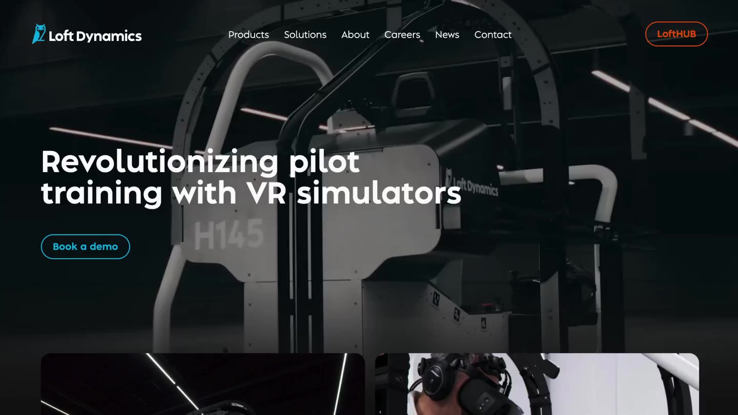
Loft Dynamics sells to very different people, from helicopter operators and pilots to aircraft manufacturers and airlines. Its brand and website spoke to none of them in particular.
- A product-centric look, in the navy blue the whole industry uses
- A website too heavy for audiences with very different needs
Approach
Every decision traces back to evidence. Each step has an ID, and every insight and decision names the evidence it came from.
S001
Source
Stakeholder interviews
Across the company, on who Loft sells to and what each group needs.
S002
Source
Website analytics
How visitors actually moved through the old site.
S003
Source
Market research
How other simulator and aviation brands present themselves.
E001
Evidence
Navy everywhere
Navy blue is used heavily across the industry.
From S003
E002
Evidence
Too much site
Many pages and deep navigation for visitors with very different goals.
From S002
I001
Insight
Four audiences
Operators, pilots, OEMs and airlines, each with its own needs and its own path through the site.
From S001, S002
I002
Insight
Sell the experience
Customers buy the full service, not only the simulator as an object.
From S001
D001
Decision
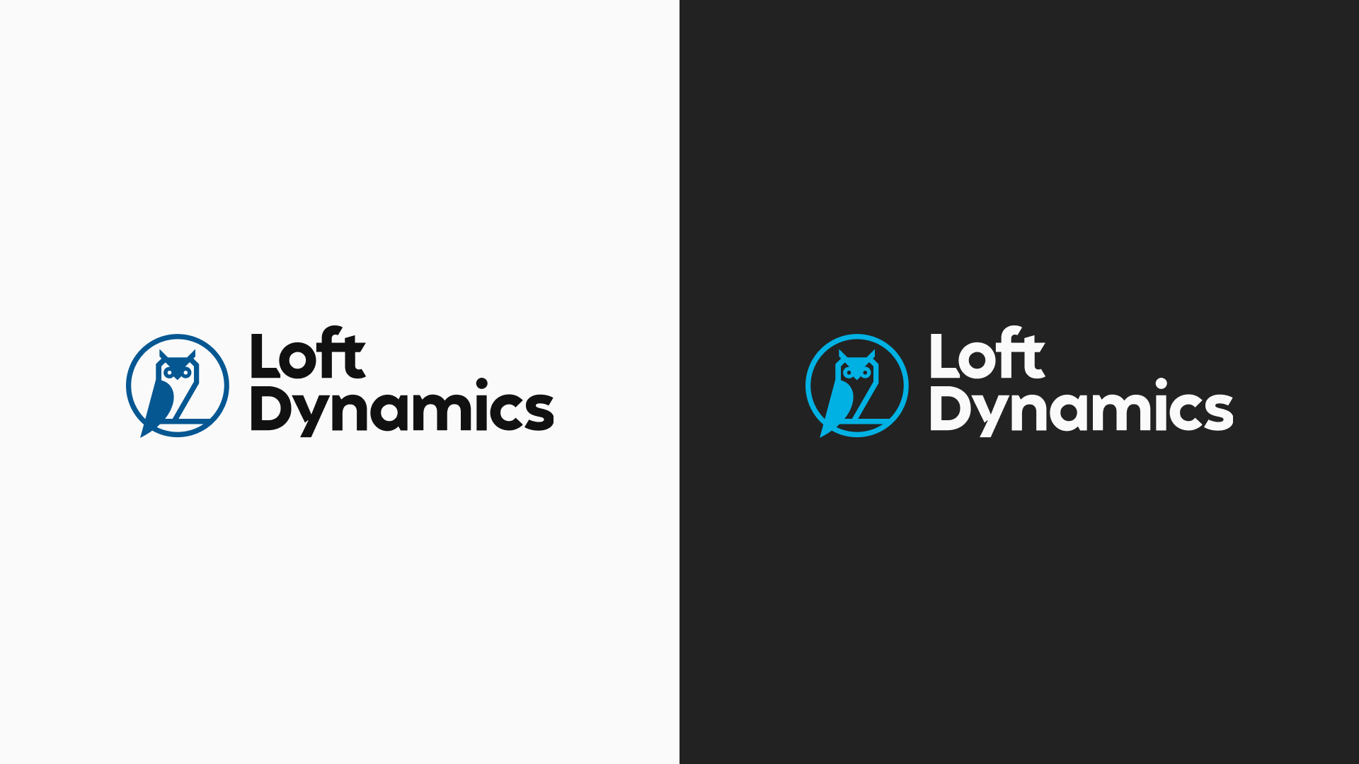
Sky blue, not navy
From the sea to the sky. The owl logo stays.
From E001
D002
Decision
Dark mode
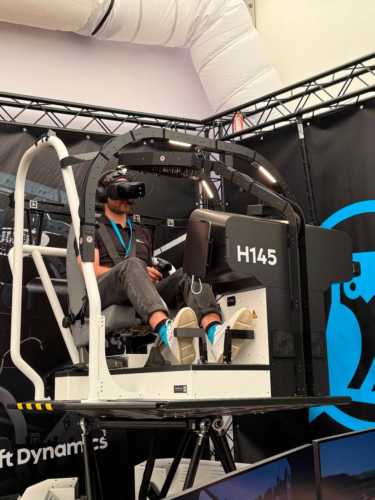
The white simulator stands out, and the brand shows the whole experience.
From I002
D003
Decision
Fewer pages, one-level menu
A lighter site that’s easy to find your way around.
From E002
D004
Decision
Products and Solutions
The three simulators on one side; what each audience gets on the other.
From I001
Solution
I led the brand refresh and the website redesign and did the work myself, from the stakeholder interviews to the trade-show look, with a front-end and a back-end developer on the build and a project manager at the client.
Brand: a light facelift
The owl logo stayed. Everything around it moved from the sea to the sky, and from light to dark.
- Navy blue became sky blue
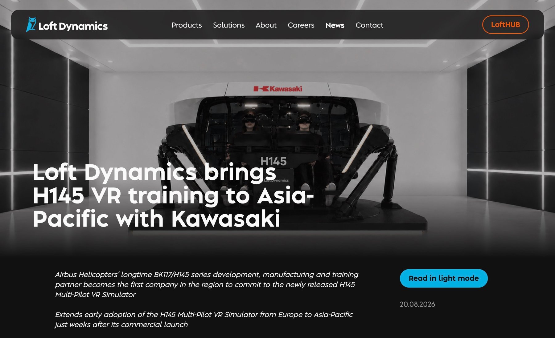
- Light mode became dark mode, so the white simulator stands out
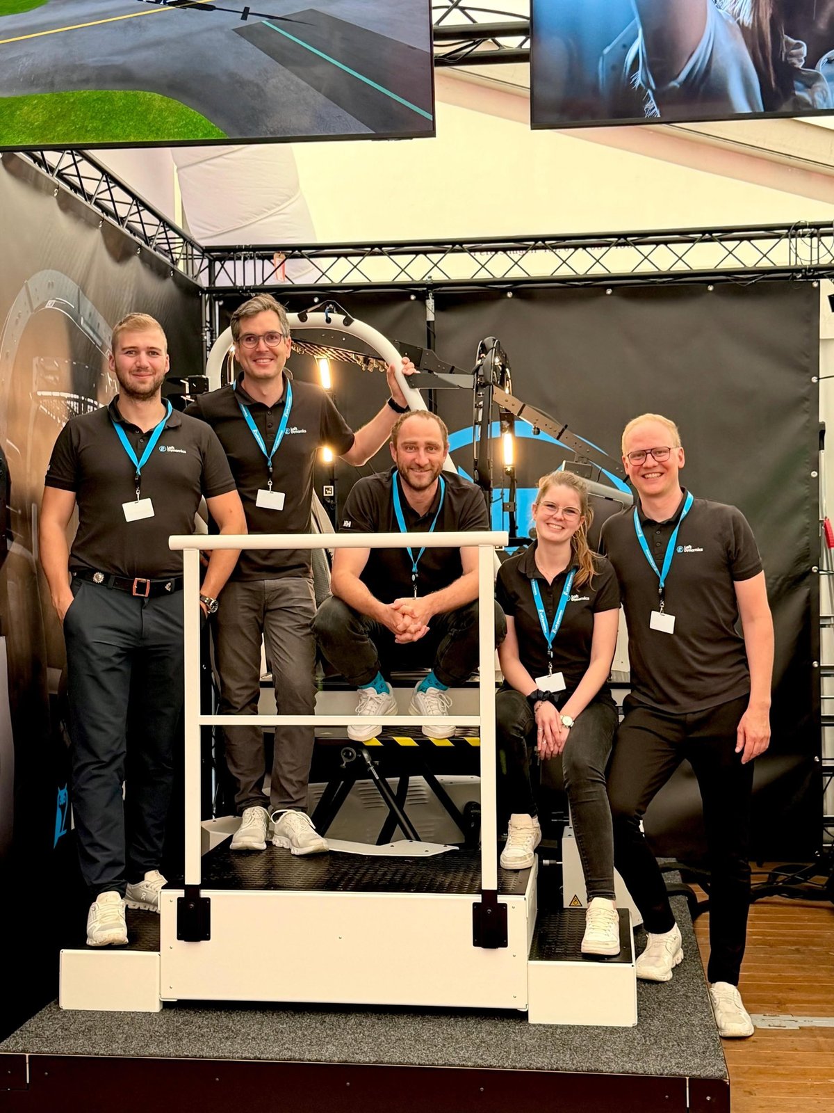
- Trade-show boxing, packaging and backdrops in dark mode, using dark VR scenes of the flight environment
- A redesigned trade-show outfit for the team
- A trade-show booking platform set up on Microsoft Bookings
Website: built around the audiences
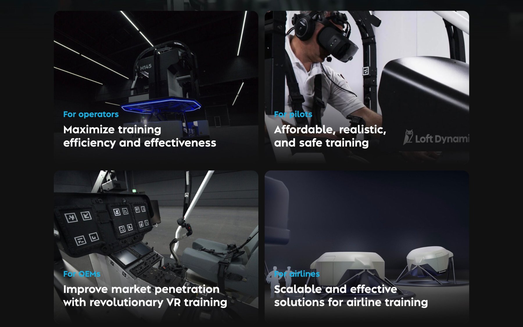
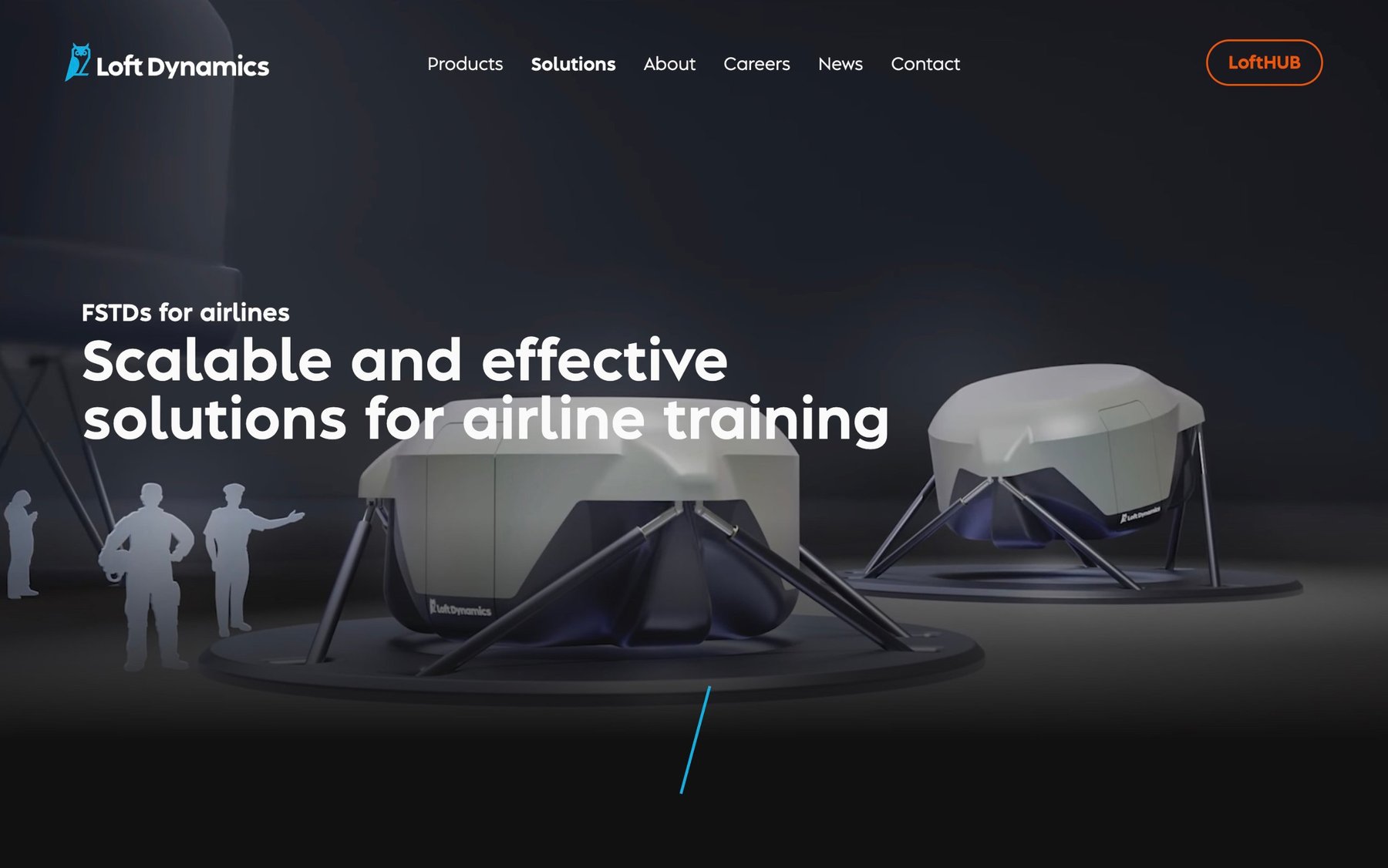
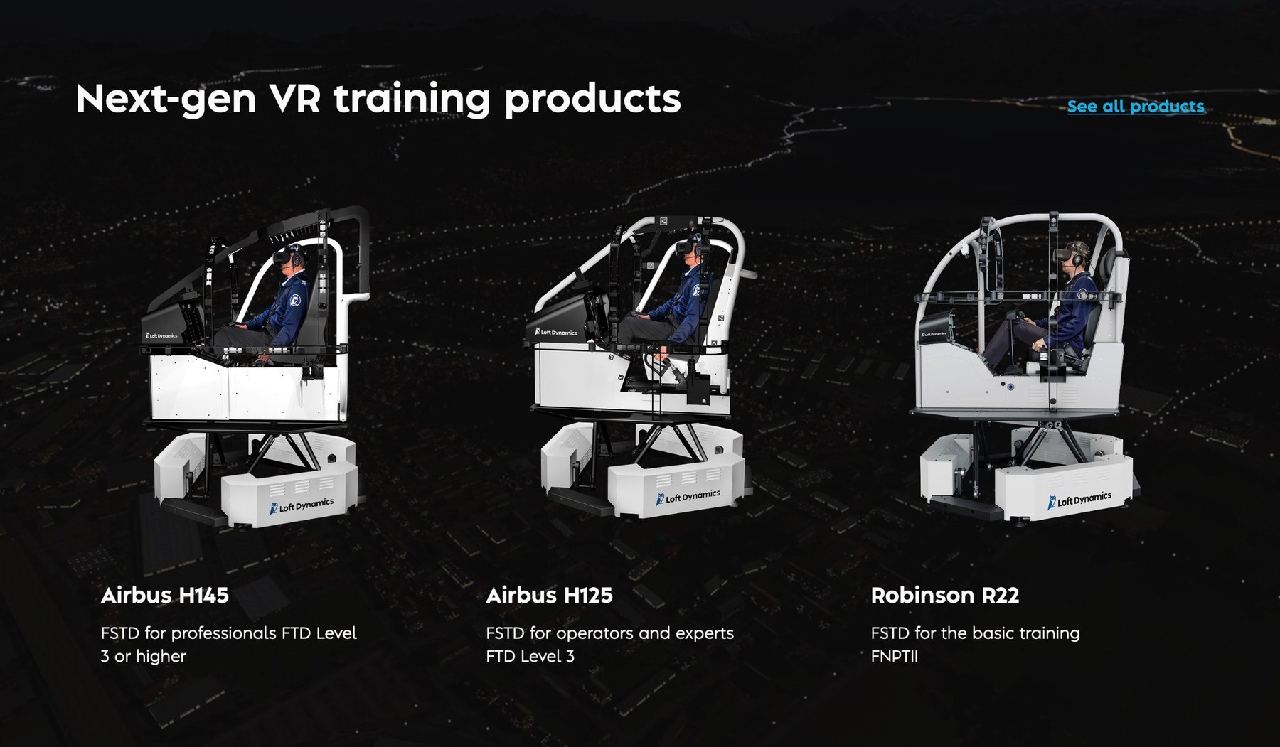
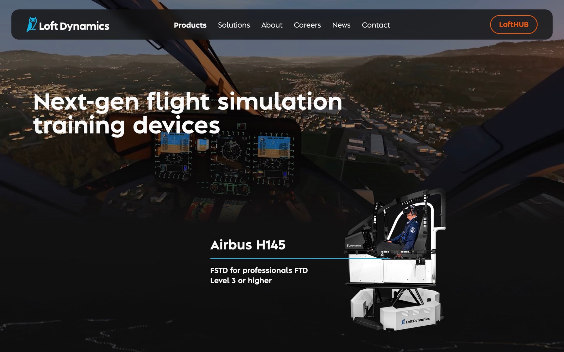
Fewer pages and a single-level menu. Products show the three simulators; Solutions show what each audience gets for its own needs.
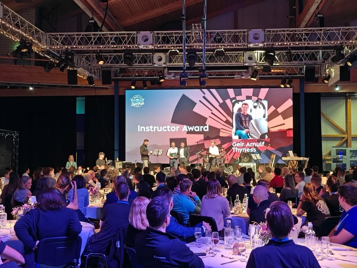
Loft Fest: the main stage
The brand also carried Loft Dynamics’ annual Loft Fest. I helped with the visuals, including animations and videos for the main stage screen.
Outcome
Website traffic grew 30% the following year, and the conversion rate rose by 10 percentage points. The brand was well received: more serious, yet more dynamic.
At trade shows, sky blue now stands apart from the navy used across the industry.
“He played a key role in bringing Loft Dynamics’ corporate identity, website, product design and internal and external communications together into one consistent whole.”
 Fabi Riesen, founder and former CEO & CTO · Loft Dynamics · Switzerland
Translated from the German reference letter