Vivi ticket validators
Field research on trains led to one simple visual cue that fixed ticket validation so well the instruction sheet was removed.
- Client
- Vivi
- Country
- Latvia
- Industry
- Rail, hardware UX
- Year
- 2026
- My role
- Project lead, UX and UI designer
- Team
- Just me, with a PM on the client side

Problem
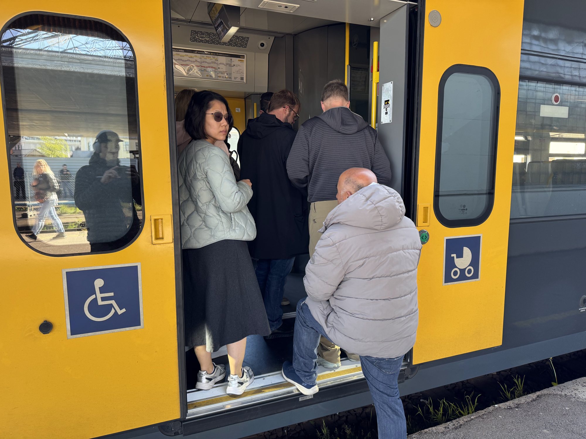
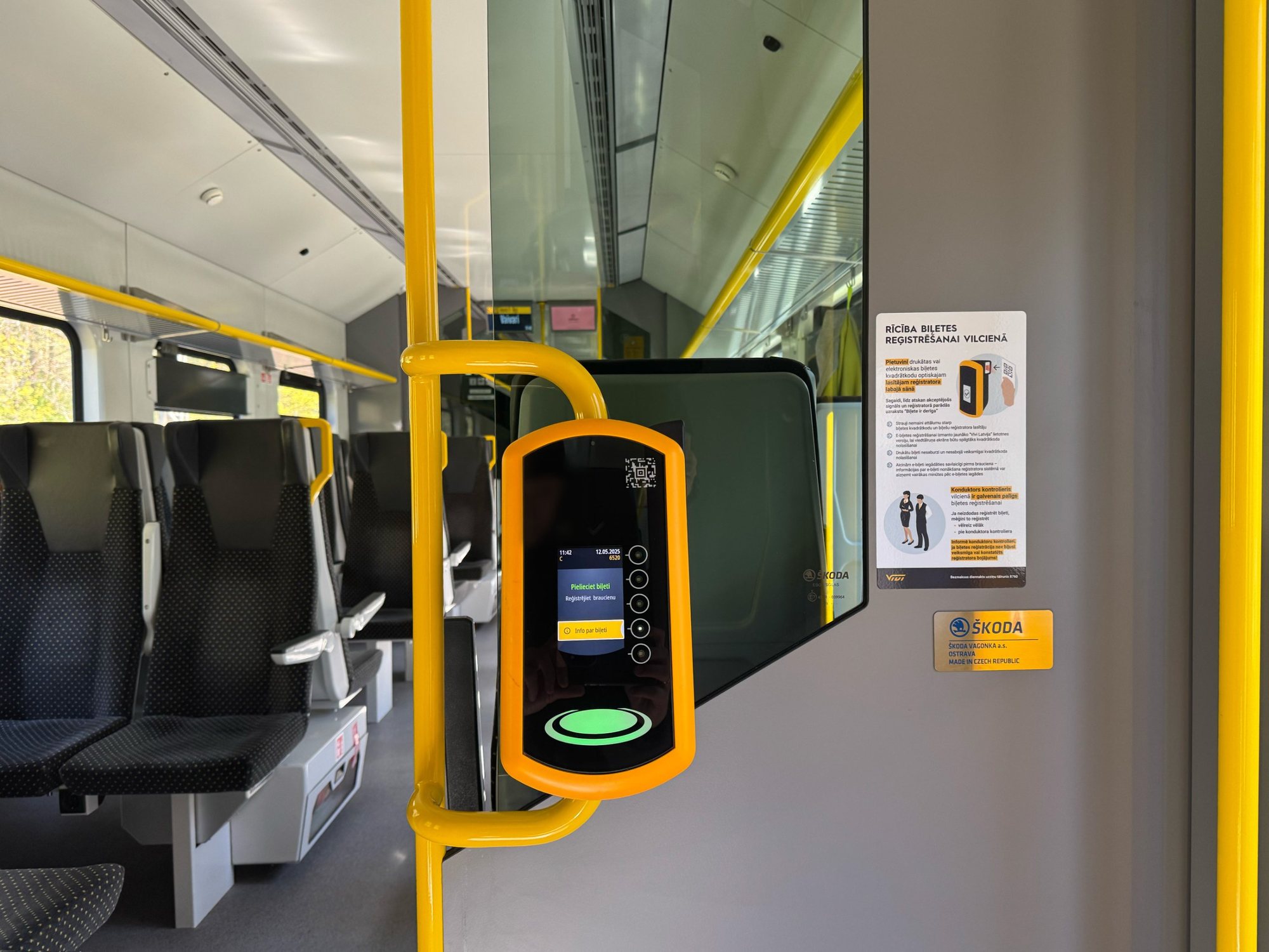
Passengers held their printed tickets to the validator's front screen, thinking it was a touchscreen or scanner. The real scanner sits on the side.
- Labels were in Latvian only, even less clear for international travelers
- The instruction sheet was long, small text that nobody read
Approach
Every decision traces back to evidence. Each step has an ID, and every insight and decision names the evidence it came from.
S001
Source
Two field trips
Watching passengers validate their tickets, and interviewing them on the spot.
E001
Evidence
Tickets held to the screen
Passengers expected the front screen to read their ticket.
From S001
E002
Evidence
Nobody read the instructions
Small text, Latvian only.
From S001
I001
Insight
The scanner needs a signal
People look where the screen is, not at the side of the device.
From E001
D001
Decision
One round, bilingual cue
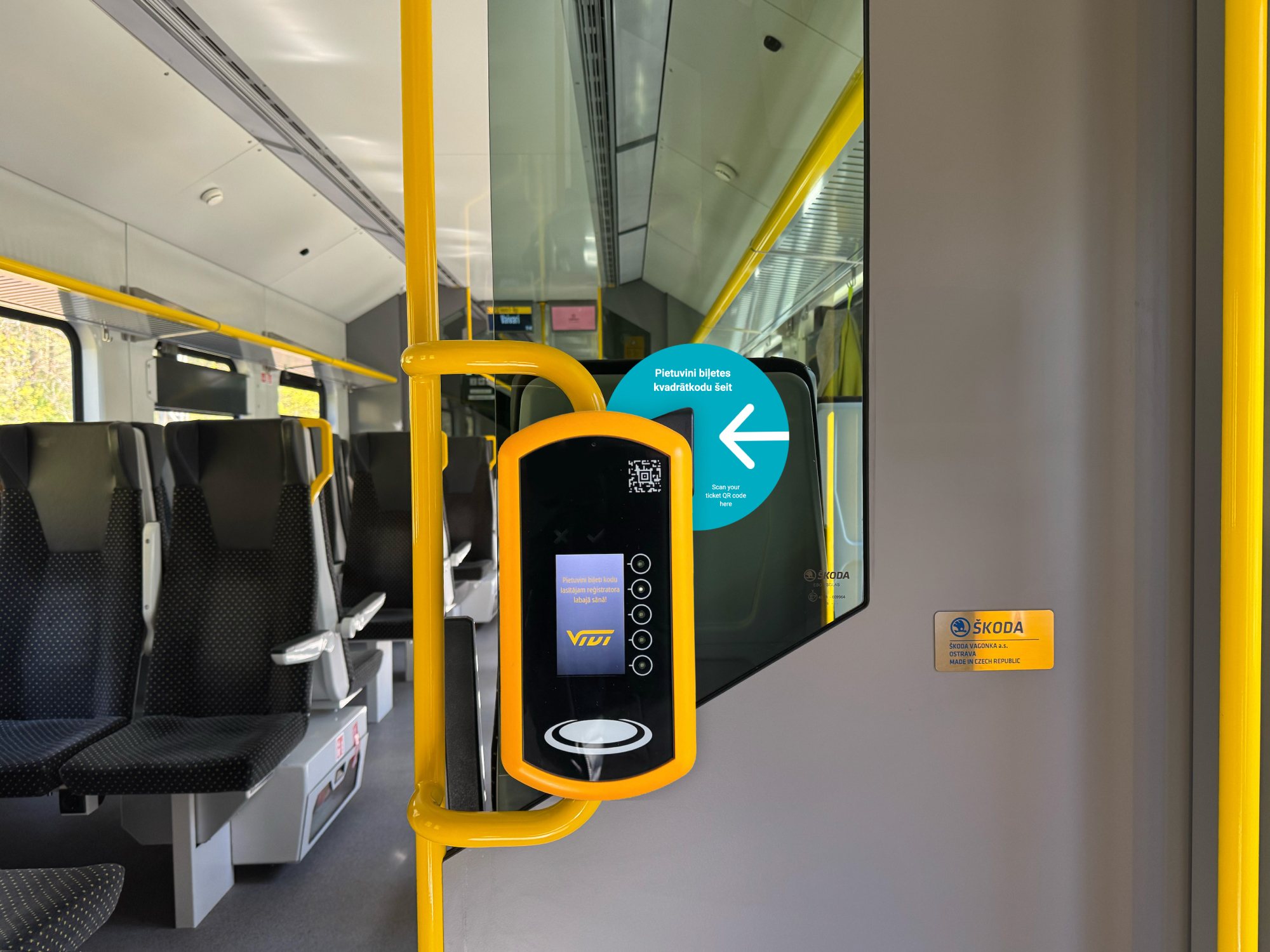
A visual element next to the scanner with a clear arrow, in two languages.
From I001, E002
Solution
A round visual element beside the scanner, with a clear arrow and text in two languages. I also redesigned the instruction sheet, though in the end it wasn't needed.
Outcome
After two field trips on board, the cue was so clear that Vivi removed the instruction sheet entirely. The successful collaboration led to the UX audit of Vivi's website and mobile app, which is ongoing.